Tooltips
Tooltips are used in a chart for contextual information. Muze creates tooltip automatically for you based on the variables assigned in encoding channel. You can further modify the behaviour and presentation of Tooltip.
Showing consolidated and fragmented tooltips
By changing the mode from config, you can configure how tooltips appear on the chart. There are two modes in which the tooltip operates:
fragmentedconsolidated
We'll take a look at both of them separately:
The fragmented tooltip breaks the tooltip into multiple tooltips for multiple points, while the consolidated tooltip displays a single tooltip for a set of points, consolidating the data present in all of them.
Let's draw a stacked bar chart showing the distribution of Cylinders by Origin. To do so, we'll color the chart using Origin.
const { muze, getDataFromSearchQuery, env } = viz;
const data = getDataFromSearchQuery();

const dataWithCount = data.calculateVariable(
  {
    name: "CountVehicle",
    type: "measure",
  },
  ["Name"],
  () => 1,
);

muze
  .canvas()
  .data(dataWithCount)
  .rows(["CountVehicle"]) // CountVehicle goes in y axis
  .columns(["Cylinders"])
  .color("Origin") // Colors encoding using the Origin field
  .title("Vehicle count by Cylinders by Origin")
  .subtitle("For year 1970 - 1982")
  .mount("#chart");
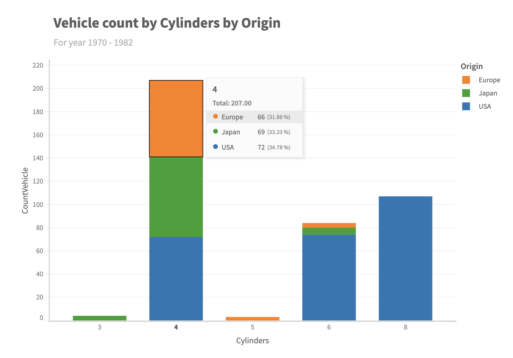
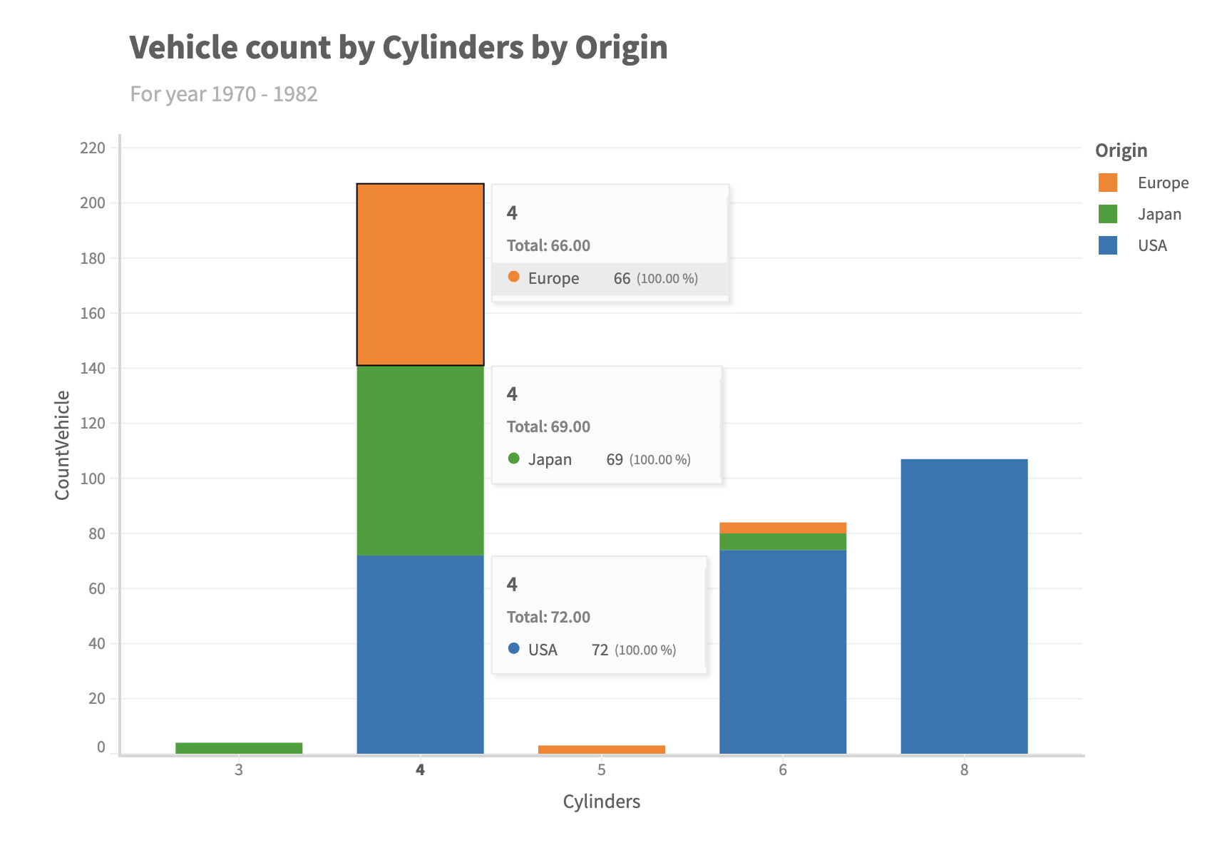
When we hover on the stacked bar chart, it shows a tooltip for all the three Cylinders in the We can change the mode to fragmented to get multiple tooltips for each of the stacks:
const { muze, getDataFromSearchQuery, env } = viz;
const data = getDataFromSearchQuery();

const dataWithCount = data.calculateVariable(
  {
    name: "CountVehicle",
    type: "measure",
  },
  ["Name"],
  () => 1,
);

muze
  .canvas()
  .data(dataWithCount)
  .rows(["CountVehicle"]) // CountVehicle goes in y axis
  .columns(["Cylinders"])
  .config({
    interaction: {
      tooltip: {
        mode: "fragmented",
      },
    },
  })
  .color("Origin") // Colors encoding using the Origin field
  .title("Vehicle count by Cylinders by Origin")
  .subtitle("For year 1970 - 1982")
  .mount("#chart");
Formatting the tooltip
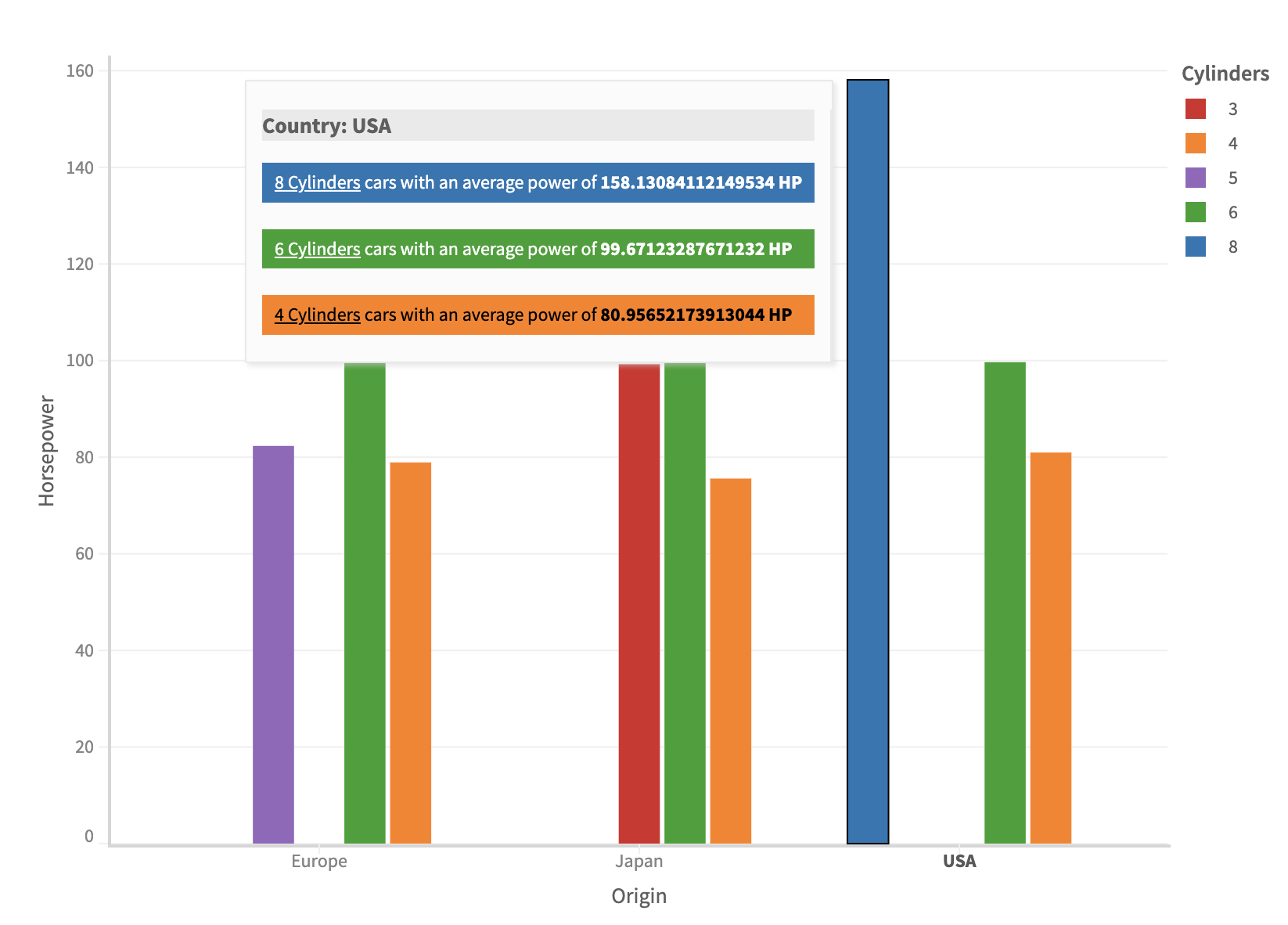
We can format the content and presentation of tooltip based on how we wish it to be. For instance, you may choose to add or remove information shown in the tooltip or show some different information completely.
const { muze, getDataFromSearchQuery, env } = viz;
const data = getDataFromSearchQuery();

const html = muze.Operators.html;

muze
  .canvas()
  .data(data)
  .config({
    interaction: {
      tooltip: {
        formatter: (dataStore, config, context) => {
          const colorAxis = context.axes.color[0];
          const dataValue = dataStore.getData();
          const tooltipData = dataValue.data;

          let tooltipContent = "";
          tooltipData.forEach((dataArray, i) => {
            const originVal = dataArray[dataStore.getFieldIndex("Origin")];
            const hpVal = dataArray[dataStore.getFieldIndex("Horsepower")];
            const cylVal = dataArray[dataStore.getFieldIndex("Cylinders")];
            const l = colorAxis.getRawColor(cylVal)[2]; // luminance
            tooltipContent += `
                          ${i ? "" : `<h3 style="background-color:#EAEAEA">Country: ${originVal}</h3>`}
                          <div style="background: ${colorAxis.getColor(cylVal)}; padding: 4px 8px; color: ${l > 0.45 ? "black" : "white"};">
                              <u>${cylVal} Cylinders</u> cars with an average power of <b>${hpVal} HP</b>
                          </div>
                `;
            tooltipContent += "<br>";
          });
          return html`${tooltipContent}`;
        },
      },
    },
  })
  .color("Cylinders")
  .rows(["Horsepower"])
  .columns(["Origin"])
  .mount("#chart");